ShopDreamUp AI ArtDreamUp
Deviation Actions


Suggested Deviants


![[CE] The Difference](https://images-wixmp-ed30a86b8c4ca887773594c2.wixmp.com/f/5faa30b4-a1b9-4303-971e-ccec9ac7b39a/d757q2z-1959e525-89fe-4f4e-9a5f-eaf6c7f930a3.png/v1/crop/w_92,h_92,x_8,y_0,scl_0.069591527987897,q_70,strp/_ce__the_difference_by_cat_rage_d757q2z-92s.jpg?token=eyJ0eXAiOiJKV1QiLCJhbGciOiJIUzI1NiJ9.eyJzdWIiOiJ1cm46YXBwOjdlMGQxODg5ODIyNjQzNzNhNWYwZDQxNWVhMGQyNmUwIiwiaXNzIjoidXJuOmFwcDo3ZTBkMTg4OTgyMjY0MzczYTVmMGQ0MTVlYTBkMjZlMCIsIm9iaiI6W1t7ImhlaWdodCI6Ijw9NzU2IiwicGF0aCI6IlwvZlwvNWZhYTMwYjQtYTFiOS00MzAzLTk3MWUtY2NlYzlhYzdiMzlhXC9kNzU3cTJ6LTE5NTllNTI1LTg5ZmUtNGY0ZS05YTVmLWVhZjZjN2Y5MzBhMy5wbmciLCJ3aWR0aCI6Ijw9MTAyNCJ9XV0sImF1ZCI6WyJ1cm46c2VydmljZTppbWFnZS5vcGVyYXRpb25zIl19.bx3HpMBpyqwzdY6O8xQRt0t-0G5K1dpS7o5FBy-ZSNg)

![o5/o3/2o2o [COMMISSION_2]](https://images-wixmp-ed30a86b8c4ca887773594c2.wixmp.com/f/5faa30b4-a1b9-4303-971e-ccec9ac7b39a/ddwca66-e6d91399-78a7-447e-93e5-415890285245.png/v1/crop/w_92,h_92,x_0,y_10,scl_0.065387348969439,q_70,strp/o5_o3_2o2o__commission_2__by_cat_rage_ddwca66-92s.jpg?token=eyJ0eXAiOiJKV1QiLCJhbGciOiJIUzI1NiJ9.eyJzdWIiOiJ1cm46YXBwOjdlMGQxODg5ODIyNjQzNzNhNWYwZDQxNWVhMGQyNmUwIiwiaXNzIjoidXJuOmFwcDo3ZTBkMTg4OTgyMjY0MzczYTVmMGQ0MTVlYTBkMjZlMCIsIm9iaiI6W1t7ImhlaWdodCI6Ijw9MTk4OSIsInBhdGgiOiJcL2ZcLzVmYWEzMGI0LWExYjktNDMwMy05NzFlLWNjZWM5YWM3YjM5YVwvZGR3Y2E2Ni1lNmQ5MTM5OS03OGE3LTQ0N2UtOTNlNS00MTU4OTAyODUyNDUucG5nIiwid2lkdGgiOiI8PTE0MDcifV1dLCJhdWQiOlsidXJuOnNlcnZpY2U6aW1hZ2Uub3BlcmF0aW9ucyJdfQ.FEJABbHVnoQpfCozR3gSrLJIwDyqWNoc8ws6ZwGVWss)


Suggested Collections


You Might Like…


Featured in Groups


Description
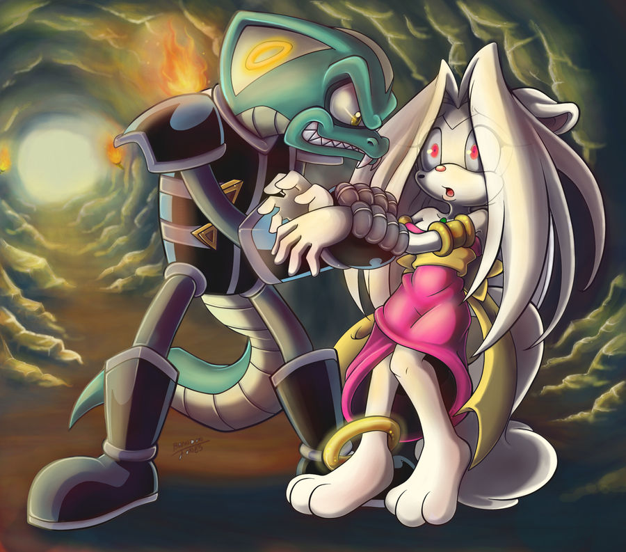
Okay, I really tried to give this good contrast, I really don't know what I'm going wrong >_< I tried to give it warm like and cool shadows as well. Again, don't know how well I did.
I totally rage quit the hypno rings too XD
Thank you to everyone who came to watch me color this! Be sure to go give some love to the original linework by

I totally rage quit the hypno rings too XD
Thank you to everyone who came to watch me color this! Be sure to go give some love to the original linework by
Image size
2048x1803px 3.26 MB
© 2013 - 2024 KissTheThunder
Comments127
Join the community to add your comment. Already a deviant? Log In
He just want a kiss (√°3°)√